This analysis of Section One of the 2007 HSC paper is designed to support class studies that relate to developing responses to Section One type questions.
Success in this part of the paper is largely dependent upon your ability to decode or understand the demands of the question and how you use the source material, i.e., citations, plates and quotes etc to support your response.
This breakdown of Section One questions from the 2007 HSC paper is designed to walk you through that process and hopefully, help you better understand what is required of you and demonstrate how you can use the source material to inform / construct a response.
Note
This paper follows the old format of questions 1a, 1b and 1c in the question numbering. The current HSC format for Section One is Q1, Q2 and Q3.
2007 Visual Art HSC
Unpacking Section 1
Question 1a
“The Blackstone Tjanpi weavers are a group of Aboriginal women from 23 different indigenous communities in Western Australia. Identify the main characteristics of their artmaking practice as represented in the images below.”
Source material; two images and the following citations.
Plate 1: Blackstone Tjanpi Weavers, Australia. Tjanpi Grass Toyota, 2005 Grass, raffia and a discarded car frame
Plate 2: Kantjupayi Benson, Basket, 2005 Grass and raffia (plus non essential information about the artist)
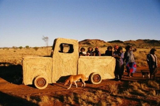
This question asks you to ‘identify’ the main characteristics. Note that this is plural, it doesn’t say how many, but certainly you need to be able to identify more than one. ‘Identify’ in its simplest reading means to name or point out. Collectively, the first clue identified in our lesson on unpacking strategies, was that the women are from 23 different communities in Western Australia and the logical inference to draw from this is that to work together, they have to communicate, plan/organise & travel, and since ‘practice/artmaking practice’ as separate from ‘material practice’ involves the sum of everything the artist does to sustain and enable their work, which includes their ‘material practice’, then communicating, planning/organising & traveling is a characteristic of their artmaking practice. The second characteristic identified in the lesson was the use of traditional / natural materials, ( grass and raffia) and non traditional materials (discarded car frame). The third was ‘collaborative practice’ as differentiated by the work of an individual member of the group in Plate 2.
Other inferences and summations were;
- An awareness of Contemporary practice, appropriation of a discarded car frame to make a non utilitarian artwork as opposed to the utilitarian application of materials in traditional basket making practice.
- An acute sense of irony conveyed through the juxtaposition of a functional basket; which in a traditional setting, would be used for gathering and carrying food etc and the use of a discarded car frame. A car can also be used to gather and carry things, including food; and wrapping the discarded frame, (throw-away) using traditional materials and techniques to produce a non functional ‘auto-basket’ was seen as very ironic and possibly conveying comment/critique about consumer society and the increasing usage of ‘throw away’ / ‘disposable’ goods in a culture that once wasted nothing.
Incidental information. This work won the Telstra Art Award 2005. On their website the work is titled “Tjanpi Toyota Dreaming” not the title given in the HSC paper. Materials quoted are raffia, grass, jute string, chicken wire and steel. The women are from 28 different communities not 23 as referenced in the paper.
In the HSC paper the failure to include ‘jute string and chicken wire’ in the listed materials would have left it to the inferencing ability of the candidate to make some assumptions as to how the rafia / grass was bound to the car frame and held in place in panel sections.


Question 1b
“Explain how Jeffrey Smart and Glen Murcutt have responded to the world around them in these artworks.”
Source material: two images and the following citations.
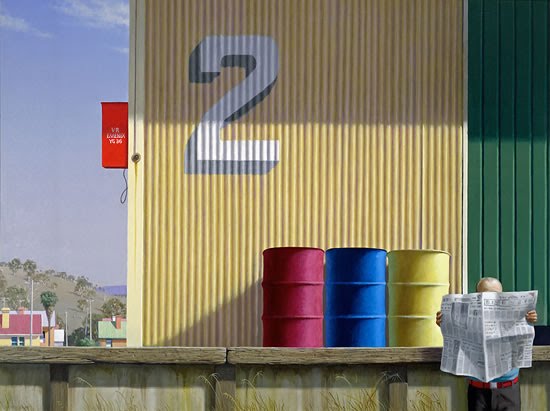
Plate 3: Jeffery Smart, born 1921, Australia, living in Italy. Morning, Yarragon siding, 1982-4, Oil on canvas, 100×134 cm.
“Smart painted this picture from a photograph he took of a railway station while traveling in country Victoria. A siding is a section of track off the main railway line. It is used for loading, unloading and storing trains”.
- Primary focus ‘Conceptual Framework’ / Artwork, Artist, Audience, World
- Explain: reference cause and effect. Remember we discussed experiences that were pretty common to all….the time you are called to account for X. Common examples thrown around were when you were young and your parents would drag you in to EXPLAIN how ‘this’ happened. And you had to do the cause and effect routine…”well mum, James was running through the house and Mary was levitating the dog in the lounge-room, I was at the kitchen table with a big bowl of blue icing for the cake, James tripped on the mat and he flew up into the air and hit the dog which went spinning through the door, bounced off the fridge and landed in the icing. And then the dog went running down the hall, ‘cause James blamed it and chased it for tripping him, ‘cause he said if he hadn’t been looking at it floating in the air he would he would have seen the mat and then the dog jumped all over your your bed ‘cause its head was all fuzzed up, see, it wasn’t my fault at all.” In this explanation you have to be mindful that a painter (Smart) and an architect (Murcutt) have very different sensibilities at work and that the ‘world around them’ can constitute significantly different things. An architect will be dealing with form, space, functionality, design, efficiency, materials, environment, client demands etc. A painter will be dealing with formal relationships of principals and elements, composition, content and the inherent qualities of the material being used, e.g., oil, acrylic, watercolour etc and the idiosyncrasies of their own practice. In discussion the collective wisdom identified the following;
- Smart, an Australian expatriate, lives and works in Italy. Could this have any bearing on the choice of colours used in the work.Australia; Green / Gold
- Australian Flag; Red, White, Blue
- Italian Flag; Green, White, Red (in the image these colours appear in the reverse order, red box, white number 2, green panelling-far right, in vertical sequence) overlaid on the green and gold.
- The number 2. Possibly referencing either Smart’s dual nationality or internal loyalties, Australia and Italy. Also note the figure, red belt, white newspaper, blue shirt.
- These are all inferences of course, and one may well argue that these are structural considerations only; but the inferences are interesting ones and ones that can be used to explain how Smart responds to the world around him; because his multicultural influences are part of that world.
- The work was derived from a photograph taken whilst traveling in Victoria. The citation says Smart lives in Italy, so a logical conclusion to draw is that the work was also painted in his studio in Italy, after the photograph was taken. This also brings up the issue of the response being one that is based on memory, and those who know Smarts’ working practice know that his images are composites based often on a number of photographs and or drawings, with elements extracted from each.
- Response to light and the ambience of the image was discussed in the context of; that the light in Australia is very different to the light in Europe and capturing that quality is an integral part of Smart’s response.
- Travel also figures as a significant component in Smart’s world. Whether, you deduce this from the fact that he had travelled in Victoria, and that possibly he would travel to be exposed to different vistas to feed his imagination and the up shot of that would be that his travels could be local, regional or international; and that aspects of that would have to be reflected in his work.
- References to the Australian environment, change, stereotypical building materials (corrugated iron as the archetypal quintessence of the australian outback).
- The lone figure resting against the siding platform, certainly not concerned about any train shunting, with all the time in the world……Those familiar with Smart’s work will know however, that the figure in his images is purely a compositional device and is often based on a photograph of one of Smart’s many friends. He could also be referencing the pace of country life and the passing of time generally.
- Interestingly, Smart wanted to be an architect prior to becoming interested in painting.

Plate 4: Glen Murcutt, architect, born 1936, Australia. Magney House, 1982-4, Bingie Point, New South Wales. Corrugated iron, steel, glass and brick
This house was commissioned by the Magney family to be built on the location of their favourite coastal camping site.
- Firstly here you have a family wealthy enough to commission one of Australia’s leading architects to build a house on the their favourite camping site. The architect now has a responsibility to meet the clients needs as they are presented to him and this acts as a constraining factor for his creativity and innovativeness. This constraint to varying degrees is part of the architects world. Inside this constraint he must still be able to exercise his creative freedom and this is the challenge. This will also be informed by material, environmental and financial factors. So Murcutt does not have Smart’s option to respond with relative freedom.
- Secondly Murcutt must somehow make this commission work so that it fits into the body of his work as an architect and that it enhances his reputation and is consistent with, if not better than his previous creations and do all this and still ensure that his clients are happy.
Some other points brought up in discussion were;
- The roof line of the building reflected / harmonised with the wave forms of the sea or iconic spaces like the Opera House. Missing from that discussion were the probabilities that the roofline was designed to catch and channel rainwater in an area where there was no connection to a domestic supply.
- The building was designed to maximize the use of natural light and the view to the surrounding environment.
- Water storage was unobtrusive.
- Use of primarily modern materials, steel frame, galvanized iron etc.
- Possibly utilized a very energy efficient design which also did not impose itself on the environment.

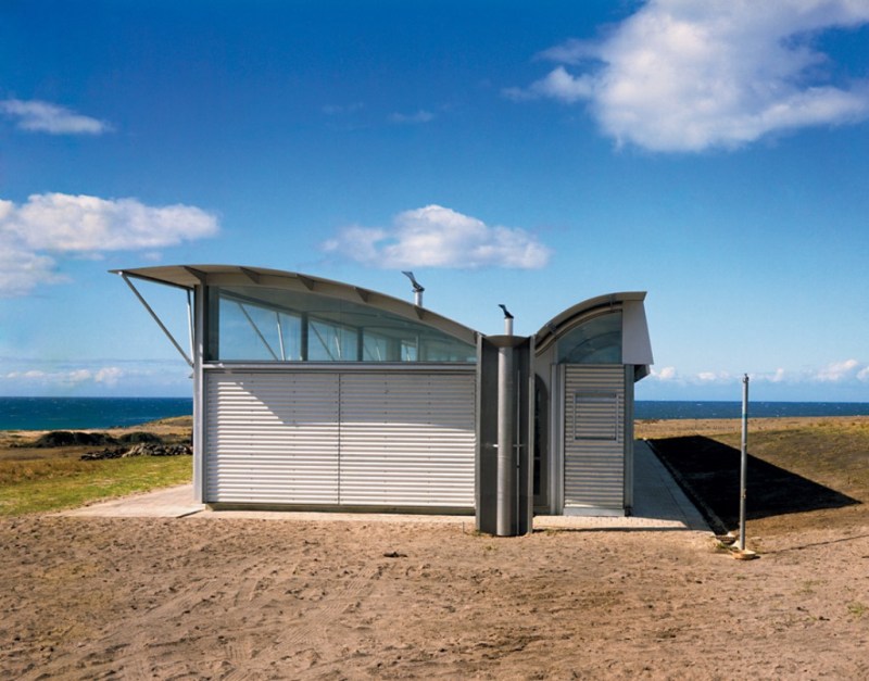


images courtesy of http://www.arcspace.com
Question 1c
“Using the postmodern frame, analyse how Ah Xian and Barbara Kruger have revised and challenged traditional artmaking conventions. In your answer refer to Plates 5 to 8.” Source material: 4 plates and citations. Plate 5: Ah Xian, born 1960, China. He lives and works in Australia and China. China, China – bust No 10, 1998 This porcelain sculpture was cast from a human figure. The decoration was applied by ceramic workers in China Plate 6: Chinese vase from the Qing Dynasty 1662-1722 Glazed porcelain with cobalt blue decoration 33cm high
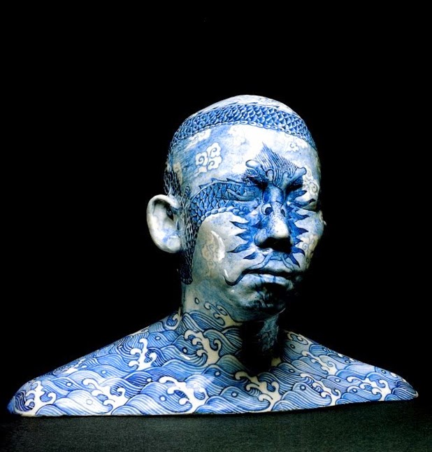

Plate 5 Image courtesy of NSW Board of studies
To begin with ‘analyse’ generally means; ‘to examine in detail in order to discover meaning, essential features or break down into components or essential features’. In this case, the spirit of this question is closer to ‘examine in detail in order to discover meaning’.
Key to answering this question is a comprehensive understanding of the Postmodern frame. Notions of appropriation, quotation, re-contextualization, irony, pastiche etc need to be referenced in the analysis of how Ah Xian and Barbara Kruger have revised and challenged traditional artmaking conventions. Crucial here is a working knowledge of what those artmaking conventions are, otherwise it will be difficult to see how these have been either revised or challenged. There are various arguments about the role of artistic conventions and whether they are or are not tempered by cultural considerations that influence interpretation and the transparency with which the artists intention is made clear. Conventions also influence the way audiences read artworks and this is one of the most likely areas challenged by these works. A more traditional reading of art conventions places it within structural aesthetics or the utilization of related principles or within genre structures, hence; the conventions of Landscape or Portraiture, etc. So let’s look at Ah Xian first.
Below the image of Ah Xian’s porcelain bust you are presented with an image of a Qing Dynasty vase with traditional motifs in cobalt blue. Ah Xian’s sculpture quotes and re-contextualizes these motifs and possibly the functionality of the vase. Arguably there were porcelain works from the same era as the vase that were purely decorative and non functional, so it would be a little difficult to argue that functionality is being challenged, so what is?
- (the term ‘quote’ is used here in the same way you do when you apply it to text / language, where you re-state, reiterate or reference a statement to support a point of view. Re- contextualization happens when you place the ‘quote’ outside its normal ‘environment of use’. Ah Xian re-contextualizes these traditional motifs as tattoo’s, and enforces this reading, because this is what we identify patterning on the skin as, and then hooks the viewer into the secondary reading of the tattoo, as a marker of identity. In this way Ah Xian challenges the traditional conventions that enforce a viewers interpretation of the motifs as having a particular association.)
The porcelain cast of the head and shoulders of a Chinese national speaks more about what it is to be Chinese than anything else. The motifs sit like a tattoo on the skin, and here is where the first real challenge to the convention that influences the audiences reading takes place. The eyes are closed and the motif of the dragon covers the eyes, not seeing and not being seen. What is Ah Xian referencing?
The tattoo is difficult to remove, as is one’s cultural patterning and influence. It speaks more about the indelible nature of one’s cultural traditions. At the other end of the spectrum, the bust is part of Classical Western Art tradition and is not a mainstream practice in China, the bust could represent his own body or identity as an artist located in a Western Art tradition or environment indelibly imprinted with a cultural conditioning which he cannot escape. Class discussion revealed most of this, along with some interpretation of the motifs on the vase and what these meant in relation to the bust.
Other works from the China China series by Ah Xian

Head 1 (from ‘China. China’ series) 1997 Porcelain body-cast, with hand painted underglaze


China China,
1999 Porcelain with under glaze blue and overglaze enamel images courtesy of http://www.artmolds.com/ali/halloffame/ah_xian.htm
And now Barbara Kruger…
Plate 7
image source http://arteknyc.files.wordpress.com
Kruger’s quotation and re-contextualization of 17th century French philosopher Rene Descartes’ classic statement ,“I think therefore I am” (which has for centuries framed Western Civilization’s notion of human identity) was one of many successful works that thrust her into the limelight in the 1980’s.
Key characteristics of her works were identified as;
- Black-and-white photographs overlaid with captions set in white-on-red in Futura Bold Oblique.
- The use of declarative phrases, such as “Your body is a battleground,” “I shop therefore I am.” etc
- The common use of pronouns such as “you,” “I,” “we,” and “they.”
- Addresses the cultural representations of power, identity and sexuality,
- Challenges the spectacles of stereotypes and cliches.
The question is supported by 2 plates and citations. Plate 7: Barbara Kruger, born 1945, USA Untitled (I shop therefore I am), 1987 Photographic Silkscreen on vinyl, 305 x 305 cm Plate 8: Barbara Kruger’s artwork printed on shopping bags.

image source http://www.madmoizelle.com
Of the two artists, Kruger is the easiest and most straightforward to deal with in the context of the question. Kruger; in these images, and in her body of work, has successfully challenged and revised the conventions that influence /determine the reading of artworks, which are part of artmaking conventions. In terms of the conventions of aesthetics she, like many before her, has had to use the traditional conventions of formalism / formalist aesthetic, which were taught to her as a designer, to challenge the way we see and interpret the function of art making.
In our discussion of the characteristics of her work in relation to the question, the following was drawn out..
- “Untitled, I think therefore I am” utilizes appropriation / quotation / re-contextualization of Descartes’ statement.
- Kruger’s images critique representations of identity, gender and stereotypes .
- Kruger’s body of work critiques consumer society, values and aspirations.
- Kruger critiques cliche through the use of found images
- The presentation of images on billboards, buses, taxis, consumer throw-away items, etc, critiques the notion of authorship, the gallery and it’s role in the validation of art.
The above do not belong to the conventions of traditional readings of artworks. The conventions that govern audience interpretation of images are primarily still related to aesthetics and the conventions of genres, (landscape, still life, portraiture, body and genre scenes) and because of this you can analyse these elements within the context of the question.
Whilst post modernity has struggled to subvert these conventions, on the whole it appears to have done little more than to revise or create new categories of conventions such as those that are the hallmarks of the movement. (it’s interesting that the things postmodernity once critiqued have now become conventions themselves). These artworks still have to have aesthetic credibility and visual presence and as such have to conform to the conventions of formalism / genre whilst remaining related to the artist practice and media use.
